On December 8th, 1921, Fred R. Barnard used the slogan “One Look is Worth A Thousand Words” to promote advertisements on streetcars. This slogan has not lost its relevance to this day: Certain things can be expressed more precisely using illustrations. Thus, modern mass communication also relies on graphics to visualise or explain information. Particularly in recent years, media have increasingly utilised mathematical function graphs as visual support for text: Weather forecasts, infection curves, and stock market prices are a few examples.
Reading and interpreting function graphs is therefore essential for responsible and informed citizens. To achieve an accurate understanding of function graphs, it is however necessary to comprehend how they are created.
Use yourself and your phone to create function graphs!
Use the freely available app phyphox, or a similar app to use the sensors in your phone to generate function graphs.
The challenge is to generate the three adjacent function graphs as best as you can.
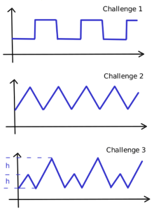
Be creative and use as many different sensors as possible. Describe your approaches precisely so that others can replicate your results. What did you do to get the different sections in the graphs?
If you want, send your descriptions including the measurement data (use the Export Data option) to mathematikdidaktik@uibk.ac.at: We will try every experiment, we promise!
This Worksheet is part of the Quartely Problem Series. For more quartely problems and other classroom materials, click here.
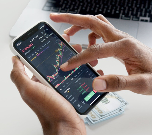
Picture Source: Anna Nekrashevich on Pexels
CC-BY-NC-SA 4.0 licence granted
Content-related competences